Your public company page is often the first place a potential customer meets your business — sometimes before they ever reach your own website. It is where your reviews, your TrustScore, and your replies live. By default it does its job, but it looks generic. Branding is how you make that page unmistakably yours.
This guide walks through everything that appears on the public page, exactly what you can customize — logo, banner, brand color, description, call-to-action, and custom links — and how to use each element so the page earns clicks instead of just displaying data.
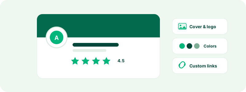
What appears on your public company page
Before customizing anything, it helps to know the full inventory. A visitor to your page sees:
- Your company name and logo, right at the top and next to every mention of you in search results and widgets.
- Your TrustScore and star distribution — the headline numbers, computed from your reviews. See how the TrustScore is calculated.
- The reviews themselves, along with your public replies.
- The verified badge, if you have completed domain verification.
- Your company details: description, website, headquarters, founding year, and category.
- Your branding, on plans that include it: a banner image across the top, your brand color applied as an accent, a rich "About" section, a call-to-action button, and a row of custom links.
The first four are earned or computed; the rest are yours to shape. Anyone with manager access or above can edit them — see inviting teammates and managing roles.
Uploading your logo
The logo lives in the Profile section of your business panel, and it is a genuine file upload — pick the file from your computer, no hosting required. JPEG, PNG, WebP, and SVG are accepted, up to 1.5 MB. Square images look best, because the logo renders in circular and square slots across the site: on your public page, in search results, and inside review widgets.
Practical advice from many logos that came before yours:
- Upload the symbol version of your logo if you have one. Wordmarks (logos that are just your company name written out) become unreadable at search-result sizes.
- Use a transparent background (PNG or SVG) so the logo sits cleanly on both light surfaces.
- Skip the tiny text and taglines — at 40 pixels they are noise.
Uploading a new file replaces the old one immediately, and a remove option is there if you would rather show the neutral placeholder while you rebrand.
Banner image and brand color
Both live in the Branding section of the panel, which is available on Premium plans and above — the panel will tell you if your current plan does not include it, and choosing a plan covers the options.
The banner is a wide image across the top of your public page — think of it as your storefront window. It is set by pasting a link to an image rather than uploading a file: host the image somewhere public (your own website is the natural place) and paste its full URL into the banner field. Use a wide, landscape-format image; the page crops to fit, so keep anything important near the center. Product photography, your workspace, or a clean brand graphic all work — a stretched logo does not.
The brand color is a hex color (like #0F62FE) applied as an accent on your page. Take it straight from your brand guidelines. One caution: the color appears behind and around interactive elements, so very light tints can leave things looking washed out. If your brand color is pale, use the darker shade from your palette.
Writing your description and About section
You have two text surfaces, and they do different jobs:
- The description, edited in the Profile section, is the short plain-text summary that appears with your company details and in search.
- The About section, edited in Branding, is the long-form space on your public page and supports rich formatting — paragraphs, links, and lists.
Tips that consistently make these convert better:
- Lead with what you do, in plain words. "We make ergonomic office chairs and ship them flat-packed across Europe" beats "We are a customer-centric solutions provider" every time. A visitor should know what you sell within one sentence.
- Say who you are for. Naming your audience ("built for small accounting firms") filters in the right readers and builds trust with them instantly.
- Address the reader directly. Write "you" more than "we". The page exists to answer a visitor's question — is this company right for me? — not to archive your press releases.
- Keep it current. An About section mentioning a promotion that ended last year quietly tells visitors nobody is maintaining the page.
Tip: read your three most recent negative reviews before writing. If customers keep being surprised by the same thing — shipping times, sizing, support hours — say it plainly in your About section. Setting expectations up front prevents the review that complains about them.
The call-to-action and custom links
The call-to-action (CTA) is a prominent button on your public page with a label and destination you choose — "Visit website", "Book a demo", "Get a quote". Point it at the single action that matters most to your business, and give the label a verb. This button is the main bridge from your reputation to your revenue, so do not send it to a generic homepage if a more specific landing page exists.
Custom links are a set of additional label-and-URL pairs shown on your profile — ideal for your careers page, support portal, documentation, or social profiles. Each link is just a label and a destination; they are entered together as a small structured list in the Branding form. Keep the set short and purposeful: three well-chosen links outperform ten, because every extra option dilutes the CTA.
How good branding affects conversion
Branding on a review platform is not decoration; it changes visitor behavior in measurable ways:
- Recognition closes the loop. A visitor who saw your ad, then finds a profile with the same logo, colors, and voice, experiences continuity. A bare profile makes them wonder if the company even knows this page exists.
- A managed page signals a managed business. Complete branding plus thoughtful replies to reviews tells readers a real team is behind the profile — which makes both praise and your responses to criticism more credible.
- The CTA captures intent at its peak. Someone who just read thirty reviews about you is as warm as traffic gets. The CTA is the difference between that person converting and that person opening a new tab to search for you again — or for a competitor.
The best-performing profiles pair branding with substance: a steady stream of fresh reviews through customer invitations and visible engagement from the company.
What cannot be changed
Just as important as what you can customize is what you cannot — it is exactly why a strong profile is worth anything:
- Reviews. Branding never edits, hides, reorders, or removes a review. Reviews are handled solely by our content guidelines and moderation.
- The TrustScore. The number is computed from reviews by a published formula. No branding setting, plan, or payment moves it.
- The verified badge. It is earned through domain verification, not styled on.
Visitors trust your page because they know you could not have bought its substance. Your branding frames the evidence; it never replaces it.
Troubleshooting
The banner does not show. The URL must be a direct, publicly reachable link to an image file — open it in a private browser window and you should see just the image. Links to pages that merely contain an image will not render.
The links field will not save. The custom links list must be a valid structured list of label-and-url pairs; a stray comma or bracket is the usual culprit. Fix the syntax error shown and save again.
The color will not save. Use hex notation, like #1A73E8. Three, six, or eight-digit hex values all work.
Branding is locked. The Branding section requires Premium or above. Your logo and company details in the Profile section stay editable on every plan.
Changes are not visible yet. Public pages cache briefly — give it a moment and refresh. If something is truly stuck, contact support.