Your TrustRating profile generates a constant stream of activity: new reviews, replies from your team, profile visits, widget impressions, invitation clicks. The analytics section of the business panel turns that stream into something you can steer by — charts and headline numbers that show whether your reputation is improving, where the friction is, and which of your efforts are paying off.
This guide walks through where the analytics live, what every number on the page really measures, and — most importantly — how to translate what you see into decisions.
Where to find your analytics
Open the business panel and choose Analytics in the navigation. Everything on the page is scoped to the company you are currently managing, and everything respects a single history window that you pick at the top of the page: 7, 30, 90, 180, or 365 days. Every chart and headline number recalculates for the window you select, so you are always comparing like with like.
How far back you can look depends on your plan. Entry-level access shows a short recent window as a preview, while paid plans progressively unlock longer history — enough to see seasonal patterns and the long arc of your reputation. Ranges beyond your plan's allowance appear locked rather than hidden, so you always know what a higher plan would add. Plan details live in choosing a plan.
The headline numbers
The strip at the top of the page summarizes the selected window in seven figures. Here is what each one actually counts:
- Reviews published — reviews that went live on your public profile during the window. Submitted reviews that are still in moderation are not included, so this is the number readers actually saw.
- Owner responses — public replies posted by you or your team.
- Response rate — owner responses as a percentage of published reviews. This is the single best proxy for how engaged your company looks to a prospective customer scanning your profile.
- Average rating — the plain average of star ratings on reviews published in the window. Note that this is not your TrustScore; more on the difference below.
- Invites sent — review invitations that went out to your customers during the window.
- Invites → reviews — invitations that converted into a submitted review. Divide this by invites sent and you have your invitation conversion rate, the key health metric of your collection pipeline.
- Widget impressions — how many times your embedded TrustRating widget loaded on your own websites.
The charts and what they tell you
Below the headline strip, the page breaks activity into daily charts:
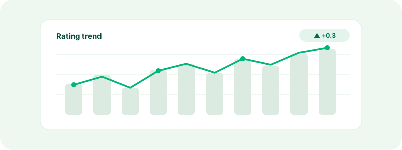
- TrustScore trend — a line of daily score snapshots across your window. This is the number the public sees, tracked over time, and it is the chart to check first. A gentle drift matters more than any single day.
- Review volume — reviews per day. Healthy profiles show a steady drumbeat rather than isolated spikes; steady volume also keeps your TrustScore fresh, because recent reviews carry more weight in the score.
- Owner responses — replies per day. Gaps here usually mean reviews are sitting unanswered.
- Profile views — how many times people opened your public TrustRating profile. This is your top-of-funnel: it tells you how many potential customers are researching you.
- Widget impressions — authorised loads of your embedded widget across your sites, per day. If you have widgets installed, this shows how much of your own traffic is seeing your rating.
On plans that include benchmarking, an industry benchmark section also compares your TrustScore against companies in your category: the category average, the best score in the category, your rank, and your percentile. It is the fastest way to answer "is 4.2 good?" — the answer depends entirely on what your competitors score.
Read trends, not data points
The most common analytics mistake is reacting to a single day. One bad review, one quiet week, one spike in profile views — individually these mean very little. What matters is direction over a meaningful window:
- Pick the widest range your plan allows and look at the shape of each chart before zooming in.
- Compare windows of the same length. Thirty days against the previous thirty days is a fair comparison; last week against last quarter is not.
- Expect noise at low volume. If you publish five reviews a month, your average rating will swing wildly and your response rate will jump in 20-point steps. The fix is more volume, not more worrying.
Tip: Check analytics on a fixed schedule — weekly or monthly — rather than after every notification. Scheduled reviews of the data keep you focused on trends; ad-hoc checks keep you reacting to noise.
Turning insight into action
Each metric points at a specific lever. A quick diagnostic map:
- Review volume is flat or falling → your collection pipeline is the problem. Start or scale review invitations; invited reviews arrive steadily and are marked as verified purchases.
- Response rate is low → readers see silence where they should see engagement. Set a weekly reply routine — our guide on replying to reviews covers how to answer both praise and criticism well.
- Average rating is slipping → something operational changed. Read the recent critical reviews as a set and look for the repeated theme; the AI Brand Pulse report does exactly this summarization for you.
- Profile views are high but conversions feel low → your reputation is being researched but not leveraged. Put your rating where buyers already are with embedded widgets.
- Invites sent is high but invites → reviews is low → your invitation timing or channel is off. Send closer to the delivery moment, and make sure the link is prominent in your message.
- Widget impressions are zero → your widget is not installed or not loading; revisit the embed instructions.
How analytics relate to your public TrustScore
The dashboard's average rating and your public TrustScore will rarely match, and that is by design. The average rating is a simple mean of the stars in your selected window. The TrustScore blends star ratings with recency and volume so that fresh, consistent feedback counts for more — the full logic is explained in how the TrustScore is calculated.
Practically, this means the TrustScore trend chart is the lagging outcome and everything else on the page is a leading input. Review volume, invitation conversion, and rating quality move first; the TrustScore follows. If you want the score to move, work the inputs.
Exporting your data
On plans with full analytics access you can export every chart on the page as CSV for the selected window — useful for board decks, agency reporting, or joining the data with your own sales numbers in a spreadsheet or BI tool. The export reflects exactly what the page shows, so pick your range first.
Common questions
"Why don't my reviews published here match the count on my public profile?" The dashboard counts activity inside your selected window; your profile shows the all-time total. Widen the range and the numbers converge.
"A review was published but the TrustScore chart didn't move." With a solid review base, single reviews move the score only slightly — that stability is intentional. Watch the trend across weeks.
"Profile views spiked — should I do something?" Check the date against your own marketing calendar, press mentions, or seasonal demand. Spikes are opportunities: they mean more people than usual are reading your reviews, which makes reply quality and fresh volume matter more that week.
"Can I see analytics for more than a year?" The platform retains up to a year of daily history for charting. For longer records, export CSVs periodically and archive them on your side.
If a number on the page ever looks wrong rather than just surprising, contact support and we will check the underlying data with you.